Coral Communications homepage animation
Creation of an engaging homepage animation as part of their recent rebranding effort.
Client & Objective
Client: Coral Communications
Producer: Leila Makki
Design & Animation: Katya Khimenets
Coral Communications sought an engaging homepage animation as part of their recent rebranding effort. The goal was to create a 30-45 second video that would not only introduce their company but also emphasize their core values: Connection, Communication, Community, and Collaboration. Additionally, the animation needed to reflect how Coral Communications plays a crucial role in keeping cities moving, ensuring passenger safety, and driving innovation in electrical telecommunications plans.
Project Goals
Develop a brand-new logo animation.
Visually represent the company’s four key values (Connection, Communication, Community and Collaboration)
Maintain consistency with the newly designed website and branding materials.
Create an animation that is clear, engaging, and visually compelling.
Update the animation text to French based on the provided translation.
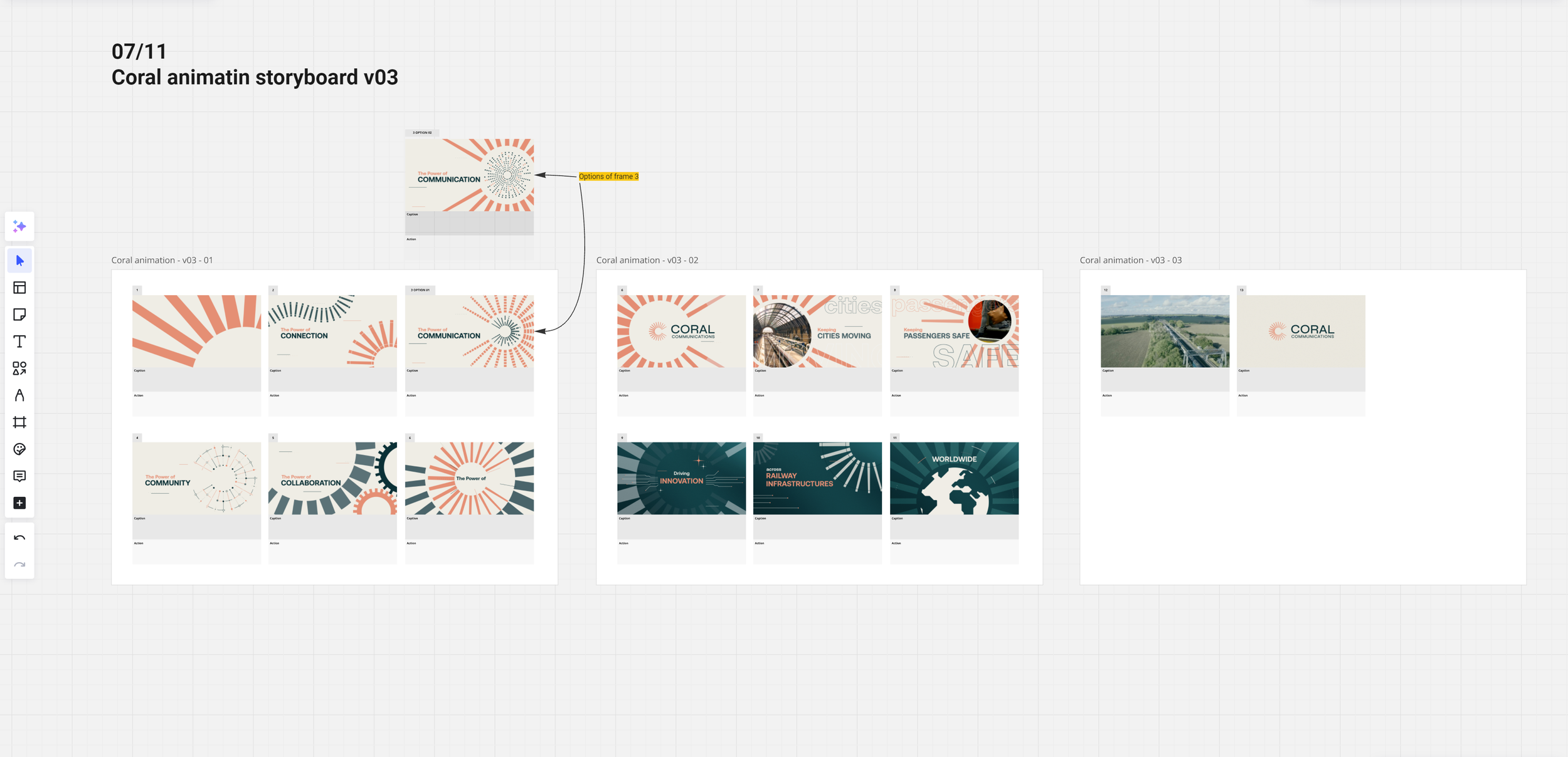
WIPs


Final designs


Design & Concept Development
I worked closely with Leila Makki and Meital Miselevich to ensure the visuals aligned with Coral Communications’ new brand identity. The brand guidelines provided a color palette and typography, which helped maintain consistency. However, the real challenge was to illustrate the company’s key features in a simple yet effective way.
We started by brainstorming visual metaphors for each of the four core values:
Connection → Train tracks symbolizing seamless movement and interconnectivity.
Communication → Sound bars representing the clarity and efficiency of communication.
Community → Dots being connected, symbolizing unity and teamwork.
Collaboration → Metaphoric cogs rotating together, illustrating cooperation and synergy.
The main shape tying these visuals together was their logo, which resembles a letter and acted as a foundation for the transitions between scenes.
Animation Process
1
Illustration & Design: All elements were initially designed in Adobe Illustrator, ensuring clean and scalable vector graphics.
2
Animation: The assets were then transferred to Adobe After Effects, where I focused on creating smooth transitions and engaging motion graphics.
3
Text Translation & Update: The supplied French translation was integrated into the animation, ensuring accuracy and consistency in both language and design.
4
Iterations & Refinements: The animation went through several rounds of revisions, experimenting with different color combinations, motion styles, and visual arrangements to ensure clarity and impact.


The outcome
The final animation successfully brought Coral Communications' brand identity and values to life. The client was extremely satisfied with the outcome, appreciating the seamless transitions, the use of anticipation in movement, and the effective match cuts. As a result of this collaboration, I was later assigned to work on an additional project—a video presentation of their services, which I will detail in a future case study.
Key Takeaways and Lessons Learned
This project pushed my skills in multiple areas:
Storyboarding & Concept Development: Finding the best way to visually represent abstract ideas.
Creative Problem-Solving: Refining the right balance of simplicity and clarity in design.
Animation Techniques: Enhancing transitions with anticipation and match cuts to create a polished final result.
Localization & Language Adaptation: Ensuring the French translation was accurately integrated into the animation.
Despite being a short animation, a lot of thought went into making each scene purposeful, dynamic, and impactful. This experience strengthened my ability to create effective brand storytelling through motion design.